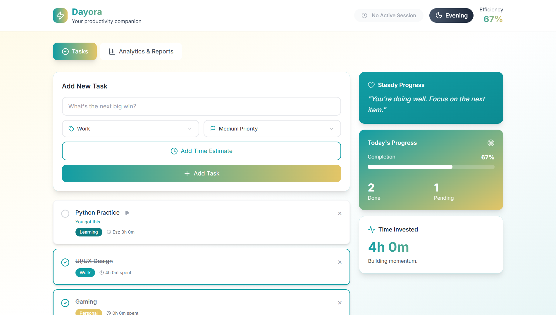
01. The Problem with Neutral To-Do Lists
Traditional productivity apps act as passive storage lockers for tasks. You type in twenty items, close the app, and walk away. When you return, the interface remains completely neutral: whether you completed the task at 9 AM or delayed it for six days, the checkbox looks identical.
This causes "list fatigue" and passive avoidance. Users overestimate how much they can accomplish in a day, become overwhelmed by unchecked bullet points, and abandon the tool altogether.
Core Hypothesis: What if a task manager reacted honestly to how you actually execute? By adjusting visual tone, time estimation, and accountability cues based on execution pace, we can guide users toward realistic time management and sustained focus.
02. Behavioral Principles Applied
Emotional Design States
UI colors and copy adapt based on time of day and completed tasks. Gentle encouragement in the morning transforms into honest urgency as evening approaches.
Time Perception & Caps
Instead of infinite task dumping, users allocate realistic 30-minute to 90-minute blocks, visually confronting how many hours actually exist in a working day.
Visual Accountability
Unfinished tasks do not simply roll over silently; they accumulate visible friction cues, prompting the user to either execute, delegate, or discard.
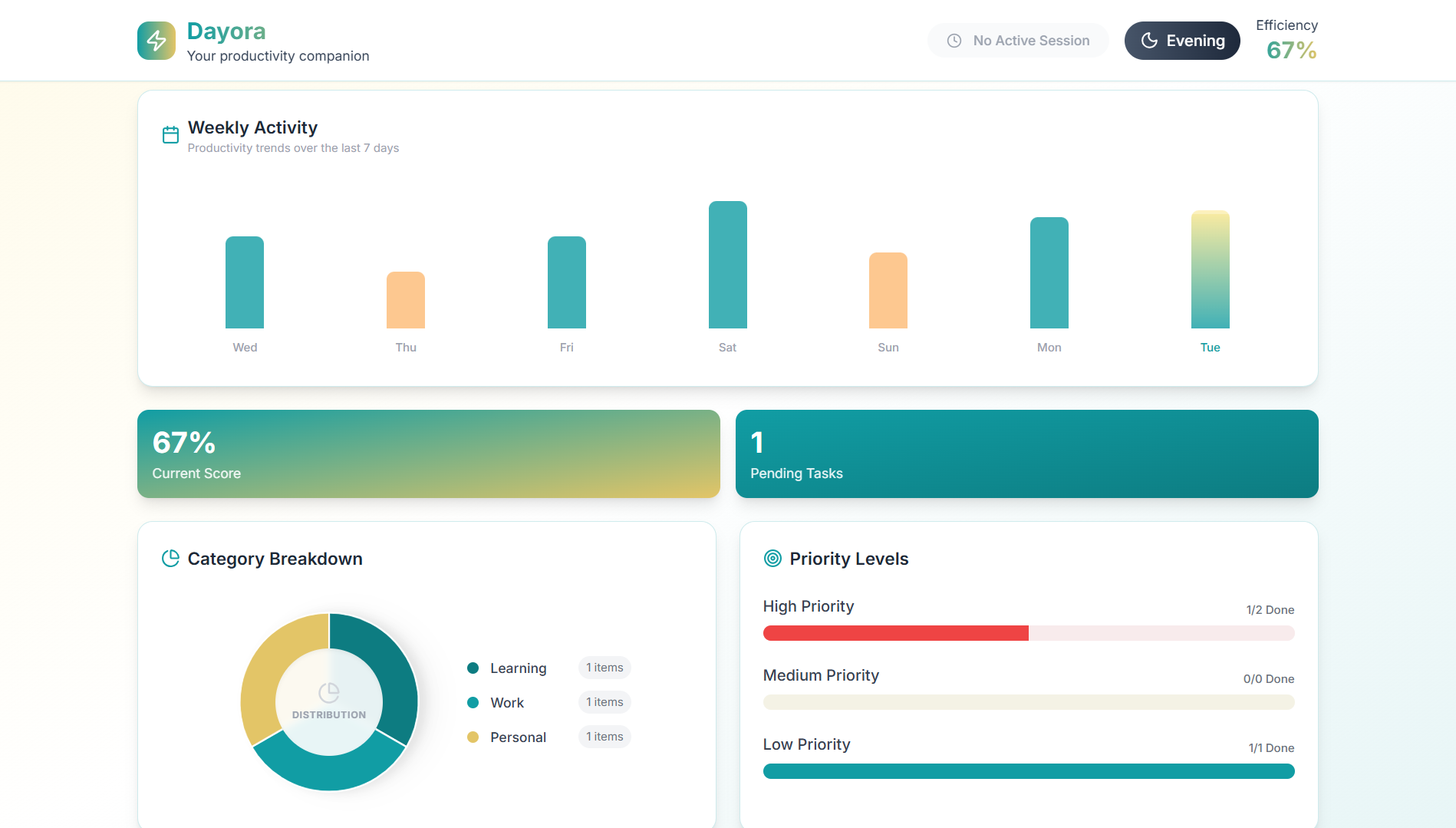
Fig 3.2 — Habit analytics dashboard displaying completion patterns, peak productive hours, and friction bottlenecks.
03. Interface Mechanics & Usability Observations
During usability evaluations comparing standard passive checklist interfaces against Dayora's adaptive feedback model, testing revealed several key behavioral patterns:
- Improved Daily Task Focus: Testing demonstrated that time-capped commitment windows helped users avoid task dumping and maintain focus on high-priority items.
- Reduced Over-Commitment: Users naturally scoped fewer unachievable tasks per day, shifting emphasis from endless checklists to achievable daily execution.
- Positive Feedback on Honest UI: Rather than feeling micromanaged, users expressed appreciation for the system's candid visual reflections of their workday.
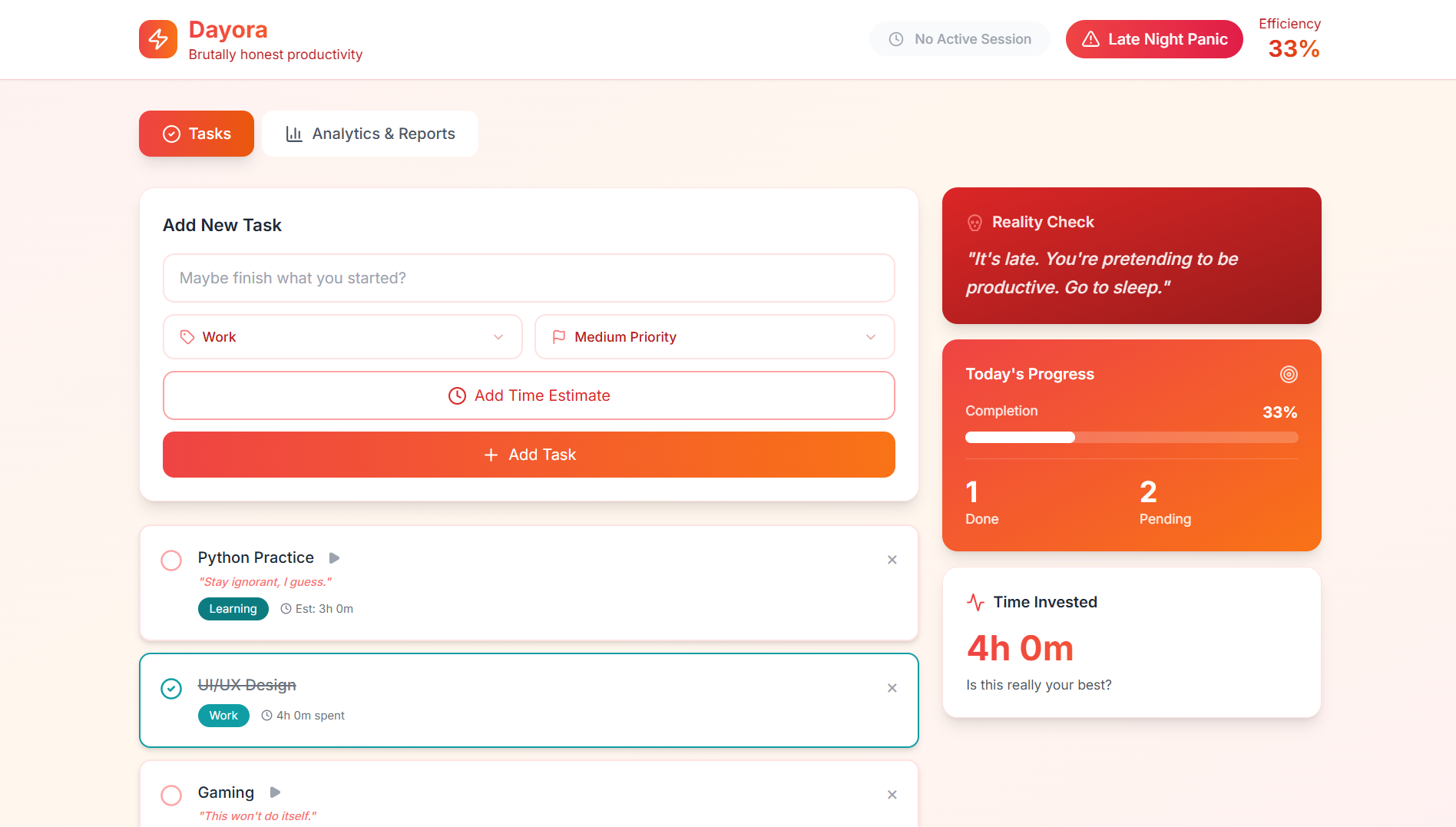
Fig 3.3 — Focused execution view stripping away secondary interface noise during active focus blocks.
04. Key Takeaways & Design Philosophy
Dayora demonstrated that good product design is not merely about decorating inputs and buttons; it is about orchestrating human psychology, emotion, and interaction mechanics. Designing interfaces that acknowledge human cognitive vulnerabilities creates tools that are genuinely helpful rather than passively decorative.